


Need Inspiration?
Get inspired by 4,000+ keynote speaker videos & our founder, a top keynote speaker on innovation.
Michael Bierut's Talk on the London Tube Considers Its Map
Riley von Niessen — March 20, 2018 — Keynote Trends
References: youtube
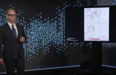
Famed graphic designer Michael Bierut recently delivered a brief talk on the London Tube for TED's 'Small Thing Big Idea' series, which examines unique examples in different societies that make use of innovative thinking.
In his talk on the London tube, Bierut examines how the map for the underground transit system is able to work so well in a large-scale city. He begins by going over the history of the map, explaining that the map used to be geographically correct, however this made it incredibly difficult to read and follow. Harry Beck later adapted the map, and took from the key insight that the people riding the train don't care about what's happening above them, they simply want to get where they need to in an efficient manner. With this in mind, he simplified it, with lines color coded and only going in three directions. In addition, all stations were equally spaced, making it much easier to read. Beck's design is the same map that's seen in the London tube today, and changed how most metro maps are created.
With this example, Bierut communicates some key components of user design, and finishes off by breaking down some modern takeaways for the audience. The first piece of advice he gives is to focus on who will be effected, the second is to find the most simple way to deliver that need, and the last is to think in a cross-disciplinary way.
3.4
Score
Popularity
Activity
Freshness